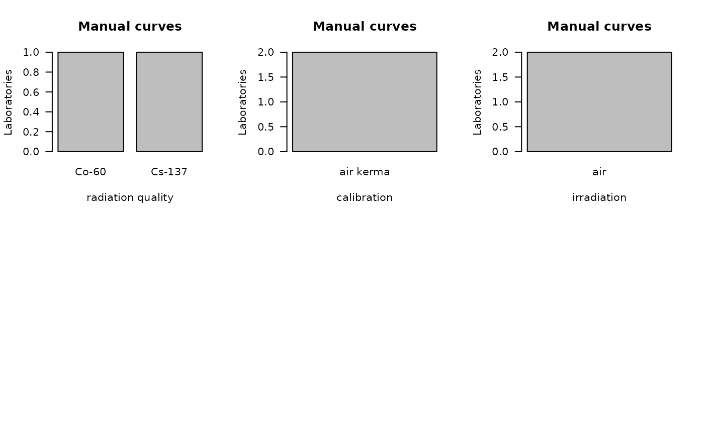
Bar plots dosimetry
Examples
dat <- data.frame(
  "Lab" = c("A1", "A2"),
  "Module" = c("dicentrics", "dicentrics"),
  "Type" = c("manual", "manual"),
  "radiation quality" = c("Cs-137", "Co-60"),
  "calibration" = c("air kerma", "air kerma"),
  "irradiation" = c("air", "air"),
  "temperature" = c(20, 37),
  "dose rate" = c(0.446, 0.27),
  "curve origin" = c("own", "own"),
  "C" = c(0.001189589, 0.0005),
  "alpha" = c(0.01903783, 0.0142),
  "beta" = c(0.0968831, 0.0759),
  "C std.error" = c(0.0001040828, 0.0005),
  "alpha std.error" = c(0.004119324, 0.0044),
  "beta std.error" = c(0.003505209, 0.0027),
  "max curve dose" = c(6.00, 5.05),
  stringsAsFactors = FALSE,
  check.names = FALSE
)


bar_plots(
  dat = dat,
  curve = "manual",
  place = "UI"
)